

When creating a Visualization in Yaguara, you will want to select the type of visual that best represents your information. Below are the options:
Line Chart
A type of chart which displays information as a series of data points called 'markers' connected by straight line segments. A line chart is often used to visualize a trend in data over intervals of time, thus the line is often drawn chronologically.

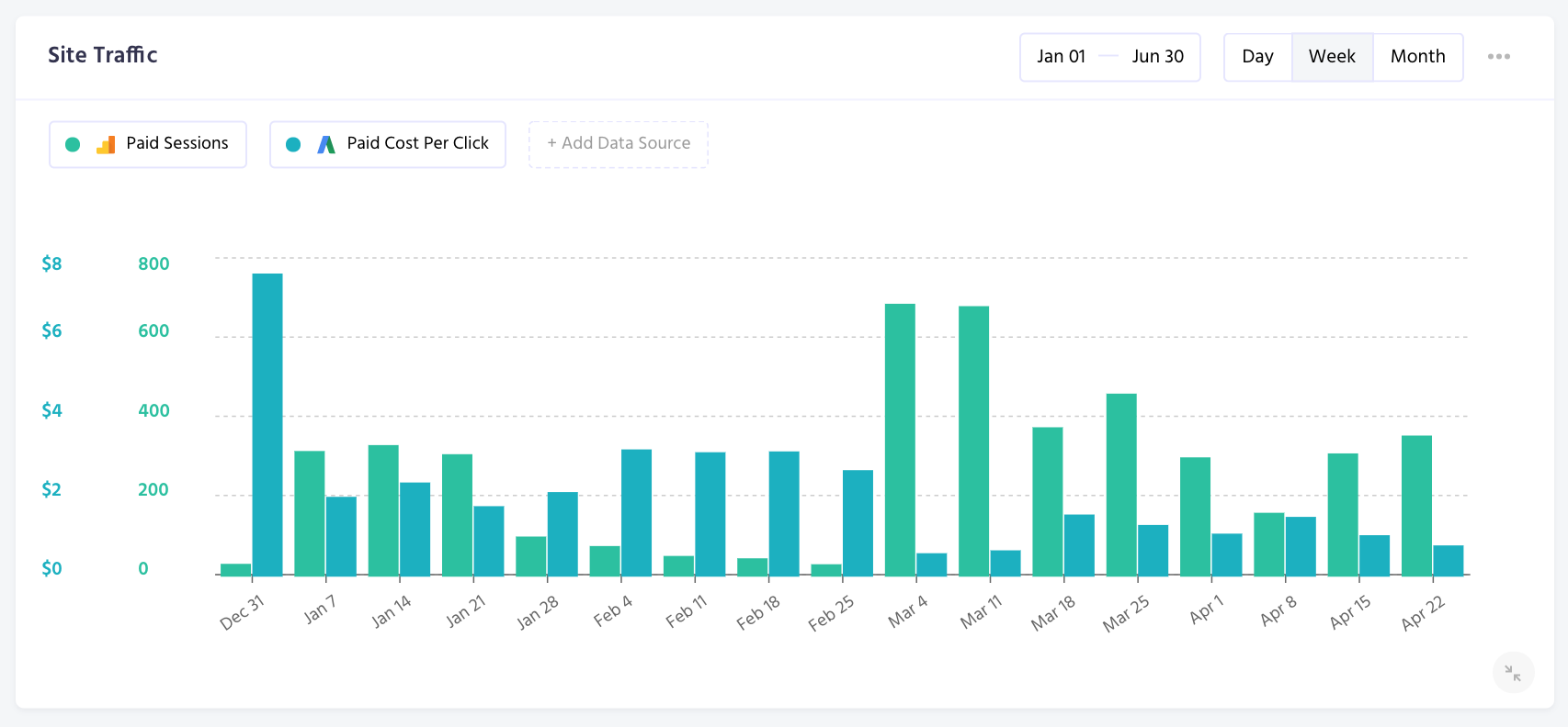
Bar Chart
A type of chart that presents categorical data with rectangular bars with heights or lengths proportional to the values that they represent. A bar chart shows comparisons among discrete categories. One axis of the chart shows the specific categories being compared, and the other axis represents a measured value.
Number Chart
A type of chart showing a summarized data point through numerical, fiscal, or percentage values.

Related Articles
Still have questions? Reach out to us at support@yaguara.co or start a chat with us!