It’s a concept that sounds simple, but yet is still so complex to this day: companies just want to look at and work with their data. After talking to hundreds of teams we’ve noticed a pattern that’s all too common in our industry – you build up a top-notch company and product line, start using a lot of necessary tools and resources to gather information on performance, but then get tangled up in the chaos of aggregating and visualizing data since no one has time to get a degree in data science in their free time.
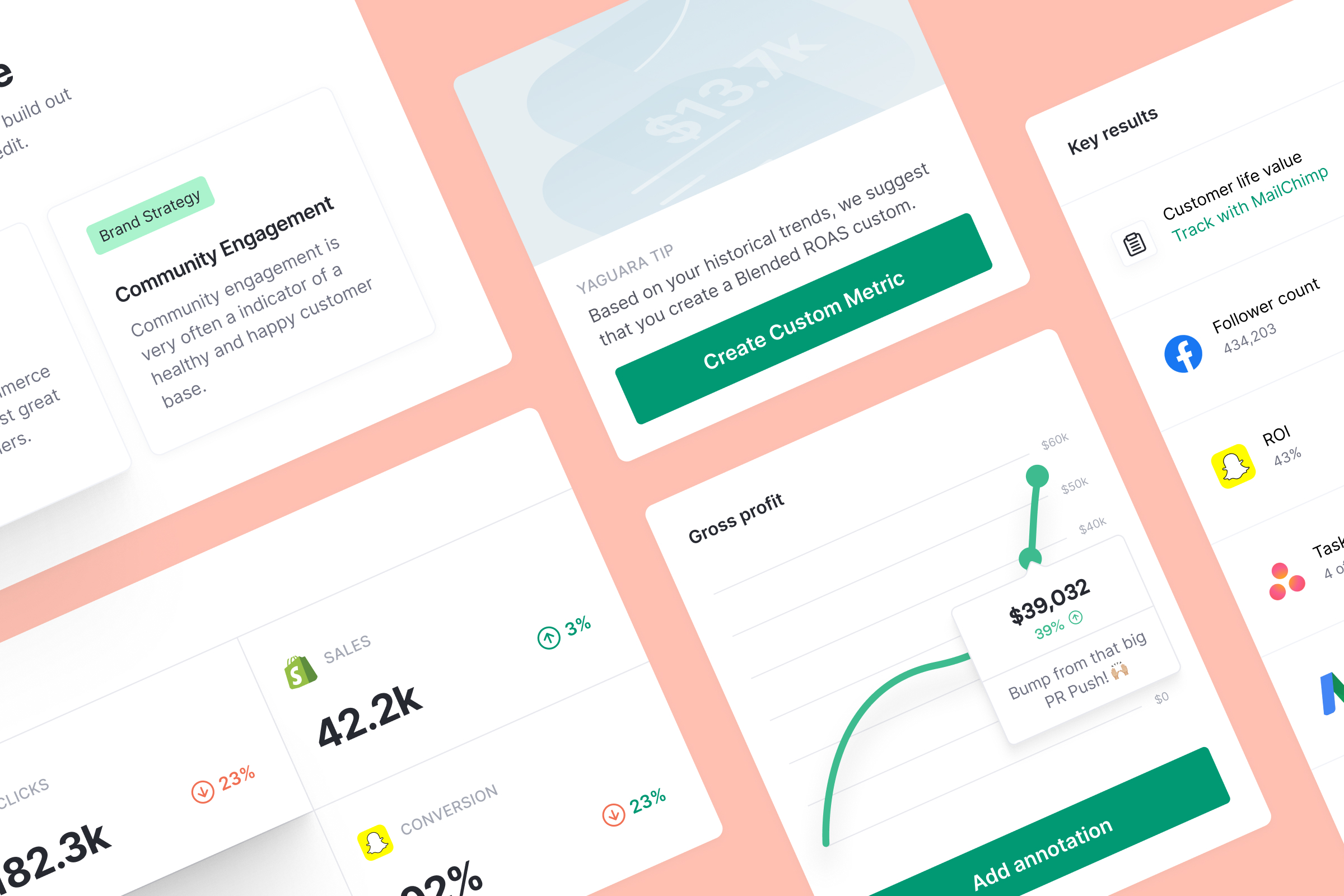
So we built this for you. Today we’re launching Dashboards, a real-time visualization from all the data you collect in order to discover trends, gain value, and make informed decisions. This will be the most versatile and customizable to visualize your data and ongoing KPIs beyond Yaguara’s visualizations in existing Objectives and Key Results (OKRs).
Interactive, custom data visualization
Last year we launched Visualizations, a way for teams to create their favorite charts and graphs and easily access them right next to their critical Objectives. It’s become a crowd favorite since it allowed both to create and attach context without having to jump into various dashboards to view the same information.
However, as we continued to discuss this element of Yaguara with people we began to understand they wanted more, an escalated need for visualization. Often a single visual was one part of the story. And often you needed more than one to get the whole story. What they really needed was a dedicated place to craft their version of what all this data was trying to tell their team. So we put this concept on steroids. Dashboards for Yaguara will allow users to create custom layouts containing a variety of visualizations from a variety of sources.

Here are a few major notes:
The single source of visual truth
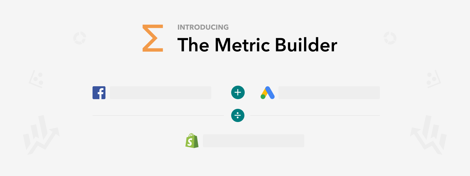
First and foremost Dashboards allows you to visualize the metrics from all of your tools. And once you are prepared, you can share Dashboards with the whole company or specific teams for collaboration. This all takes a matter of seconds.
Better decision making
At the core of every new or updated feature we keep our north star in mind: help teams them better, faster business decisions at scale using real-time data and OKRs. Dashboards is yet another opportunity to quickly detect anomalies and quickly dive into the issue. This new addition also allows for the discovery of trends by comparing multiple data sources in a single chart, even different units. This can be Traffic, Conversion Rate, Sales….you name it.

Even more ease of use
Let’s be honest, a lot of dashboard tools have a clunky user experience and are hard to set up. If you are spending the majority of your time in the help docs or manuals, rather than working with your data, you are moving laterally instead of forward. Dashboards can be quickly resized and reordered into your custom layout, no code involved.
And finally, saving you precious time
Any team serious about pushing past the status quo needs to be obsessed about efficiency. Dashboards save you time by not having to dig into each one of your tools to get the data you need to report on. Context switching can eliminate that amazing train of thought you have on a data trend, let’s keep you in that same place.
Let’s make data personal
Gone are the days of glossing over retroactive charts and graphs in traditional analytics tools. Gone are the days of staring at static images and screenshots of progress bars in monthly update meetings. Your data is real-time, and you determine its real-world context.
We’ve built Dashboards to be an antidote for this unnecessary obstacle that has surfaced with the rise of data. Because data literacy is built upon data democratization and the user experience. If a platform is difficult or if constructing a simple data story is a headache, the data won’t be used. This new feature is intended to make Yaguara even more personalized and transparent, and your business more efficient in how it analyzes and acts on real-time data.
See for yourself what it’s like to build a Dashboard:
Existing customers can create a Dashboard inside the product
New customers can test a Dashboard by setting up a time with our team
We believe Dashboards will be a huge (and necessary) step forward for all the teams who have been trapped in the attempt to become data-driven with old processes. You can start aggregating and visualizing your data without any commitment. Real-time can be an option for your team today.


.jpg)

.png)