.png)


It was predicted, and it has been delivered. Data is at the center of organizations across all industries.
At Yaguara we work with teams every day in their journey to building a more data-driven culture. Since we are bridging the qualitative and quantitative components of a company, it became very clear that there was a common request/issue: Data is only as good as it’s presented.
Teams want to hit their goals. While dashboards have been around for quite some time, the process of getting the data and insights to the right people has been too long of a process resulting in poor performance, missed opportunities, and unmet goals.
This is why we’re excited to announce Visualizations, a new, additional way to work with your data in Yaguara. Teams want to plan out their Objectives and Key Results with as much context as possible and learn about their business through viewing and comparing data more freely. And from this day forward Yaguara teams can create their favorite charts and graphs and easily access them right next to their critical Objectives.
But First, What is Data Visualization?
The Visualizations feature is Yaguara’s form of data visualization. Data visualization is the graphical representation of information and data. It enables decision makers to see analytics from their data sets presented visually, making it easier to grasp difficult concepts or identify new patterns. With the ability to interact with data visualization, you can take curiosity and the search for answers a step further by drilling down into charts and graphs for more detail, interactively changing what data you see and how it should be processed.
Data visualization technology is essential to analyze vast amounts of information and in order to make data-driven decisions.
How Data Visualization Helps
The average person is projected to generate 1.5 GB of data per day by next year. As any team grows, or even ages, the amount of raw information that needs to be collected and analyzed increases. And since data has become its own form of capital, it’ll become more and more critical for teams to sift through the ocean of data and quickly focus on the key details the help them analyze efficiency and develop new products.
Businesses are more inclined towards data visualization, due to the reason that it puts complex data into a graphical format enabling them to understand the state of their business and identify patterns to chart out successful strategies.
Thus the impact data visualization has on a market and its players can be broken down into four reasons:
1. Teams can command large amounts of data
As an increased volume of data becomes cheaper and more accessible, you can make more accurate business decisions with modern technologies. The amount of time it would take the human mind to find, build, and visualize the same data sets would be tiresome and almost laughable. The equivalent would be having to rebuild the engine in your car every day just to get to the office. Data visualization speeds up the process to the destination, which in our case is the insight gained from the visual.
2. Teams can discover and address outliers
Identifying outliers in a critical data set is an easy task with visual presentation. Outliers that hurt your averages and ultimately derail your chances of hitting goals need to be addressed at the earliest stage possible. Graphics quickly highlight them, empowering your team to understand their reason for existence for future prevention.
3. Teams can access key data in real-time
The world has shifted to real-time access and strategy for everything from back-end infrastructure decisions to in-person sales efforts. Companies that rely on outdated methods of collecting and refining large amounts of data often end up with obsolete information, or they just lose out to the competition. Teams that operate in real-time with constantly updated information will always have the upper hand when a user might need to access data.
4. Teams can quickly see the connection between activity and impact
The old process of getting insights to your team is convoluted and filled with unnecessary obstacles. It requires long and expensive implementation times, data scientists using complex tools, and a custom process for getting an insight from one team to the next. Modern data visualization solves this problem, by allowing users to visually discover the hidden relationships that connect the day-to-day processes with their business performance.
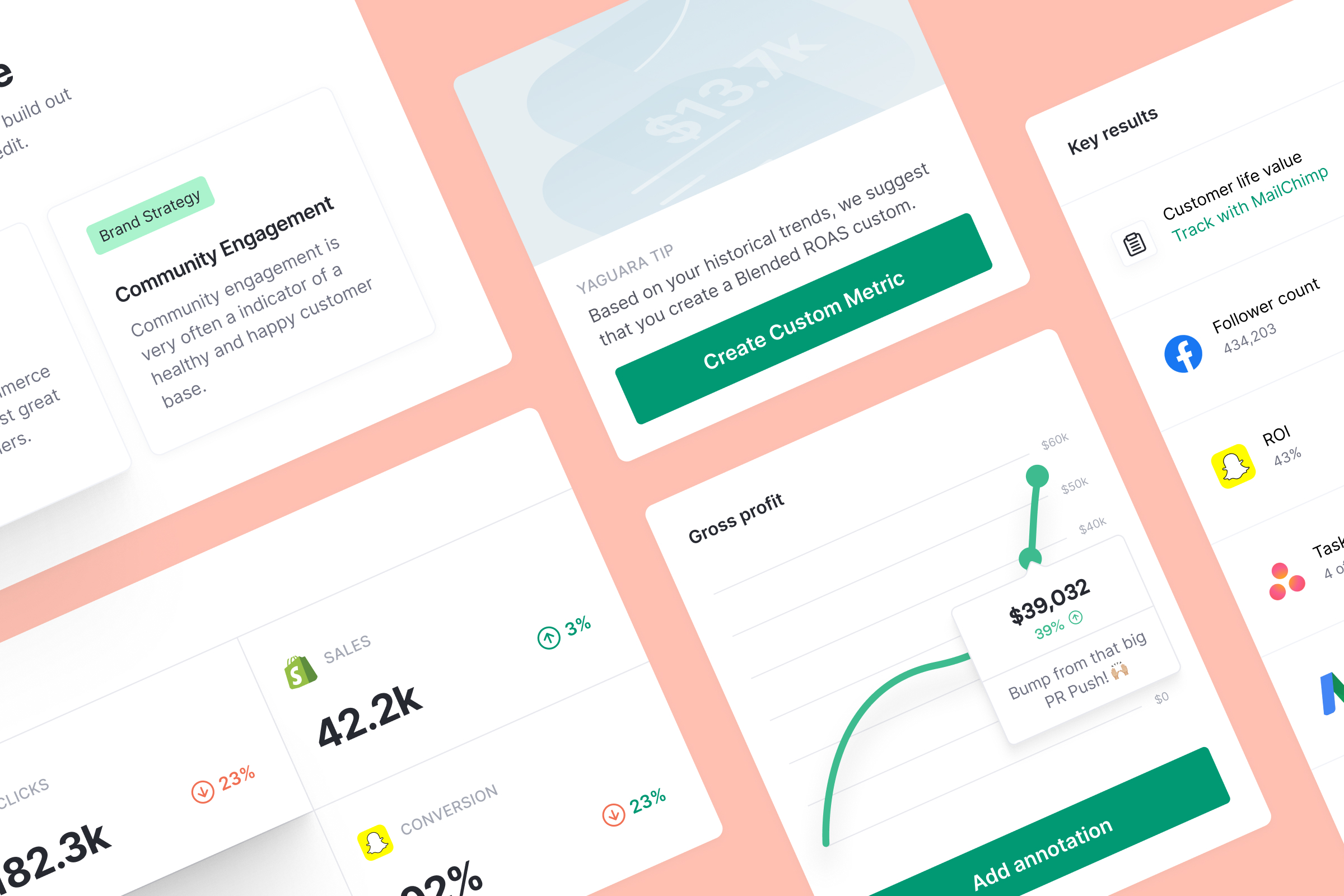
How Visualizations Work in Yaguara
Yaguara ties data visualization to an Objective. This allows to both create and attach context to high-level goals without having to jump into various dashboards to view the same information.

With this addition to Yaguara teams have complete transparency into their real-time data. This transparency allows teams to compare complementary data sources from their different integrations to help the discovery of trends. Once a trend is discovered, either manually or through a Yaguara Insight, a goal can be set for that data source to help them hit their overall Objective.
Organizing and working with data: when to use Visualizations
Each Objective in Yaguara now includes a “Visualizations” tab so you can create graphs and charts connected to that specific goal. We recommend creating Visualizations to create context on the goal in order to make more data-driven decisions. The best part? Anyone on the Objective can access Visualizations and modify the data to their preference in their personal view. This way, your team will always get the real-time information they need to do their job, in addition to tracking everything in one place.
Visualizations are especially useful when your team is seeking context in specific areas:
- Focusing on the customer acquisition funnel
- Understanding the highs and lows of a product launch
- Maximizing your organic marketing efforts
- Increasing Customer Lifetime Value
- Seeing the results of marketing site updates

What Will You Do with Visualizations?
Ultimately, this is all about telling a story. Our minds prefer a linear intake of information, especially as the complexity increases. We need to cause and effect, with a resolution somewhere on the horizon. By presenting data in a way that is visually-centered, data visualization gives raw information something that it will always be missing - a sense of progression.
Data is only as good as it’s presented. And by providing a more valuable interface to evaluate critical data, Yaguara is further enabling teams to make faster, better data-driven decisions.
If you are already a Yaguara user you can head to your Objectives to start adding Visualizations. If not, you can try it for free now or talk to our sales team to learn more.


.jpg)