Updates

New updates and improvements to Yaguara.

Google Sheets integration

Our new Google Sheets integration lets you sync your data with Yaguara to use in Dashboards, OKRs, and Reports.

See help article

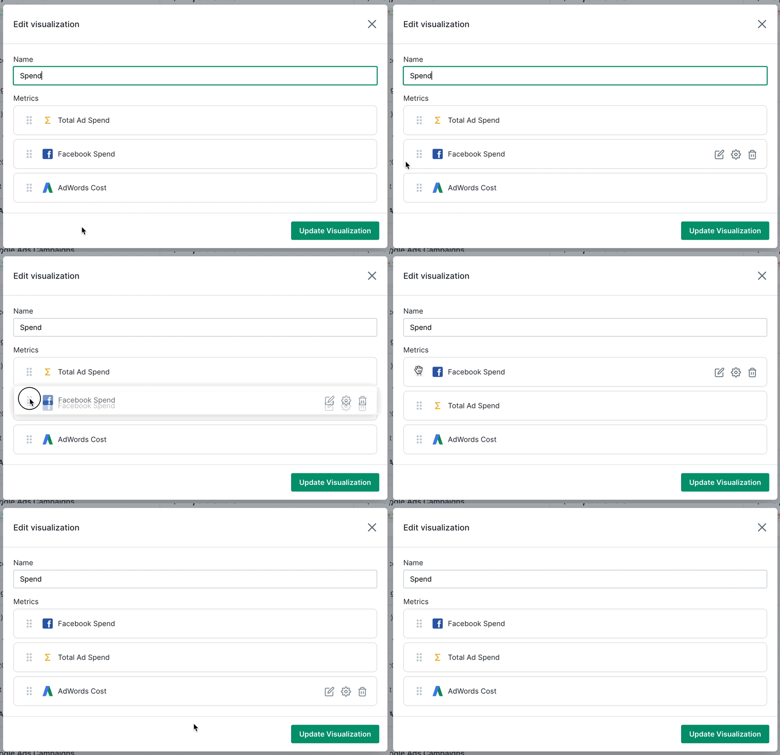
Customize metric order

You can now reorder metrics in your number and line/bar chart visualizations by dragging and dropping.

Other fixes and improvements

  • Fixed an issue where entering a decimal for a target or range would cause weird behavior
  • Optimized fetching Shopify data
  • Fixed an issue with tags for Gorgias metrics

Recharge integration

Our new Recharge integration lets you track the following popular subscription metrics plus more:

  • Orders
  • Sales
  • New subscriptions
  • Canceled subscriptions
  • Active subscriptions

Visualization improvements

We now show you the percentages of each slice on pie charts and the ability to give each metric an independent y-axis for line/bar charts.

Other fixes and improvements

  • Fixed UX for applying many filters in the Metric Builder
  • Fixed an issue of the y-axis scale in key result progress charts
  • Fixed an issue where Facebook Ads ROAS was showing 0’s in tables
  • Handle empty filter options for Google Analytics

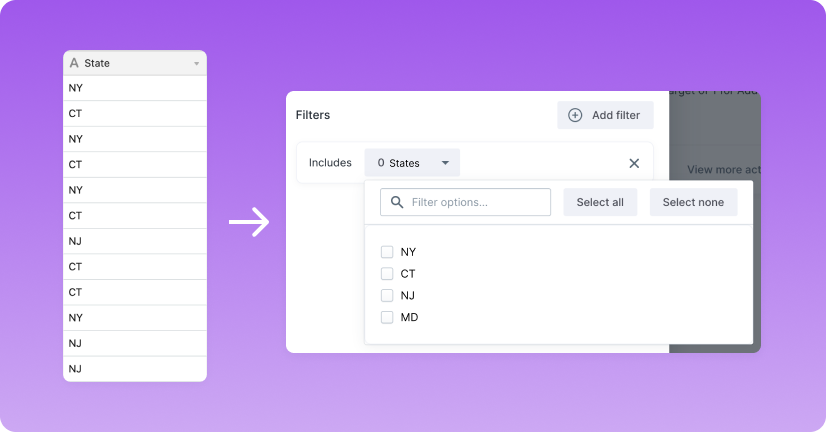
Create AirTable filters

You can now filter the metrics you create by creating filters from your columns. This is useful for seeings things like Sales by State or Sales Channel.

Key Result block for Reports

You can now show on your key result performance by adding them to your Reports. You can also choose whether or not to show the progress chart and annotations.

Combined Y-Axes for like units

We found that for line charts and bar charts that are comparing similar metrics, it was sometimes confusing because there were multiple y-axes with varying maximum values. So we combined these into one to make clearer comparisons.

Other fixes and improvements

  • Fixed an issue where user level roles could see Billing
  • Fixed a redirect issue when a trial is expired
  • Fixed an issue with incorrect Stripe data
  • Fixed issues with Sales/Expenses metrics for Xero

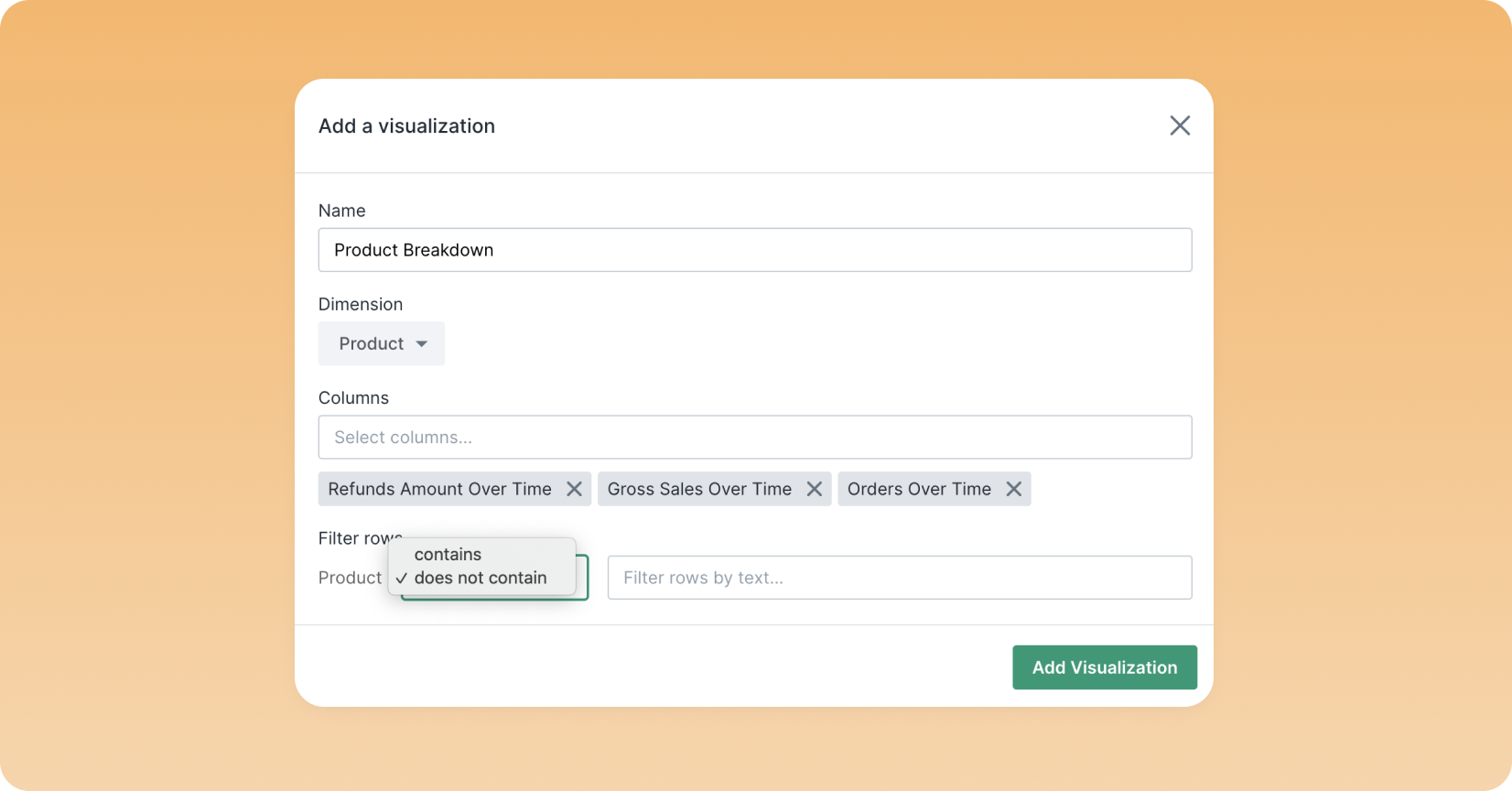
Filter rows in your table visualizations

Filter table rows to show specific products, campaigns, ads, etc. by matching the dimension to any text you enter in the table settings.

Improvements when adding filters

We made some improvements to adding filters when using the metric selector making it quicker to fetch available filters and see which ones are enabled.

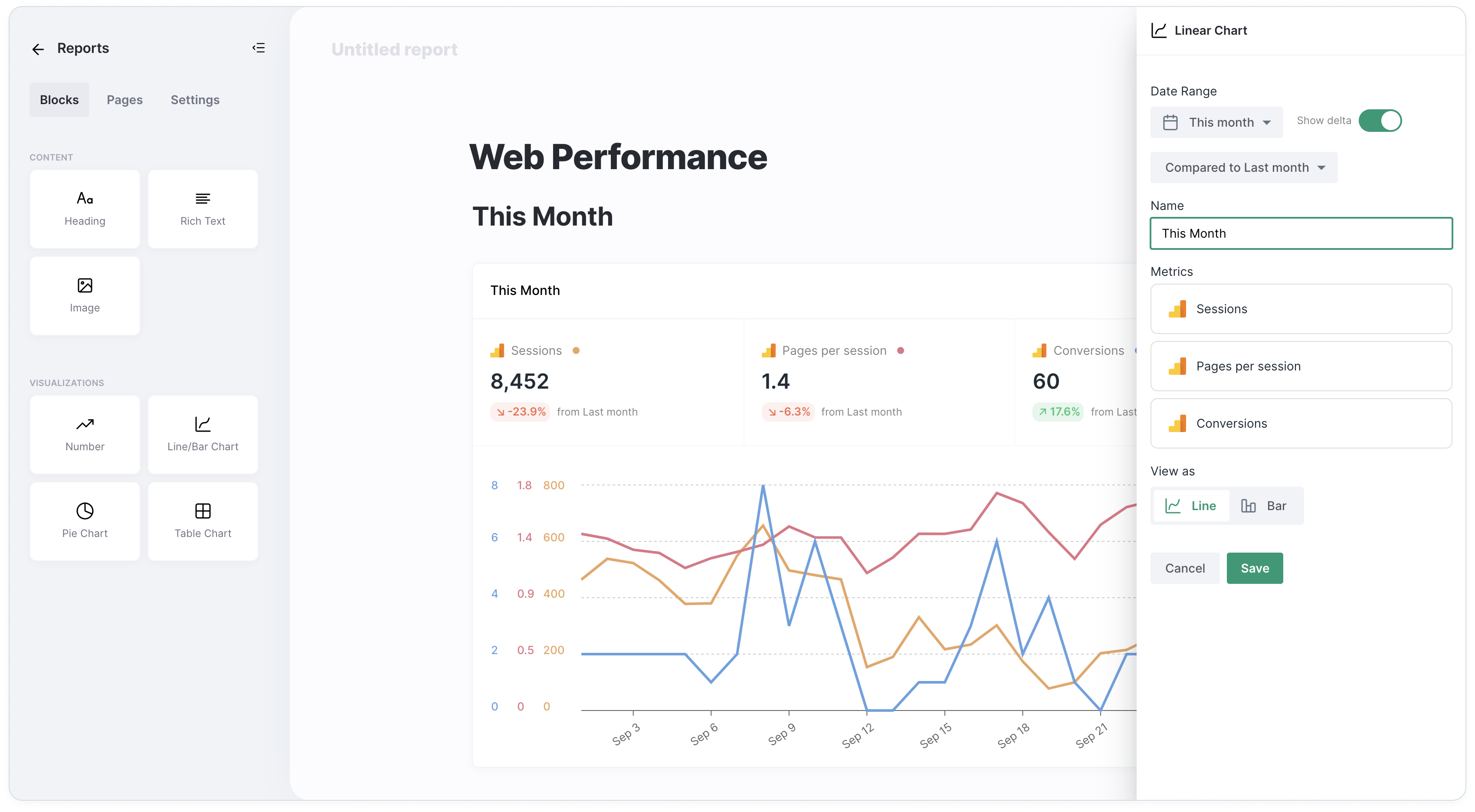
Show or hide the percentage change on report visualizations

Sometimes it's not necessary to report the percentage change from the last period so you now have the option of turning that off in Report visualizations by disabling the Show delta option in the settings.

Other improvements and fixes

  • Add a default Row Count metric to tables in AirTable
  • Improved performance for fetching filter options
  • Fixed an issue causing duplicate activity feed items
  • Fixed an issue when searching for a user to assign an objective to
  • Fixed an issue validating AirTable metrics

Xero integration

We've added the online accounting software for you to use the following metrics:

  • Expenses (can be filtered by Account)
  • Sales (can be filtered by Account)
  • Total Inventory (can be filtered by Item)
  • Cash Balances (can be filtered by Account)
  • Gross Profit Margin

Compared to options on Dashboards

You can now select which date period the totals should be compared to on number and line/bar chart visualizations which will allow you to see WoW, MoM, and YoY growth.

Additional Shopify metrics and filters

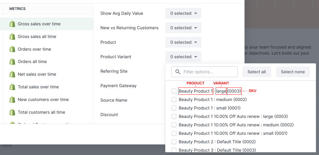
We have added Taxes and Shipping Cost metrics. Also, you can now see SKU-level data all of your favorite Shopify metrics likes Sales, Orders, and Returns for specific product variants by using the filter.

Other improvements and fixes

  • Added a Total Count metric for AirTable tables
  • Changed data syncing internal to 15 minutes for AirTable
  • Fixed issue with Report visualizations not working
  • Fixed issue with Shopify integration being marked invalid

Pie chart and table support for AdWords metrics

You can now visualize your Google AdWords metrics segmented by campaign or ad group.

Pie charts are useful when you want to see one metric, while tables are useful when you want to see multiple metrics for each campaign (ex. cost, impressions, conversions).

Other improvements and fixes

  • See upcoming objectives on group pages
  • Improved performance for Shopify queries
  • Fixed some Shopify metrics in tables displaying the wrong value
  • Fixed changing password in settings
  • Fixed name getting overwritten when creating a key result

AirTable Integration

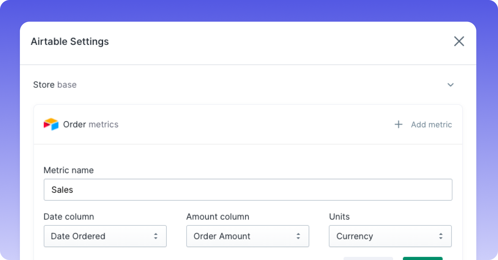
With our new premium AirTable integration, you can sync bases that contain time series data to create custom metrics by selecting the date column and the amount column.

Once these metrics are created, you can visualize them in Dashboards and set goals for them using Key Results.

Request access

Facebook Ads metrics in pie charts and tables

You can now visualize your Facebook Ads metrics segmented by campaign, ad set, or ad.

Pie charts are useful when you want to see one metric, while tables are useful when you want to see multiple metrics for each campaign (ex. cost, impressions, conversions).

Other improvements and fixes

  • Fixed sorting issue on tables
  • Fixed issue when accessing Timeline would crash
  • Fixed issue when connecting a second Shopify store

Shopify support for pie charts and tables

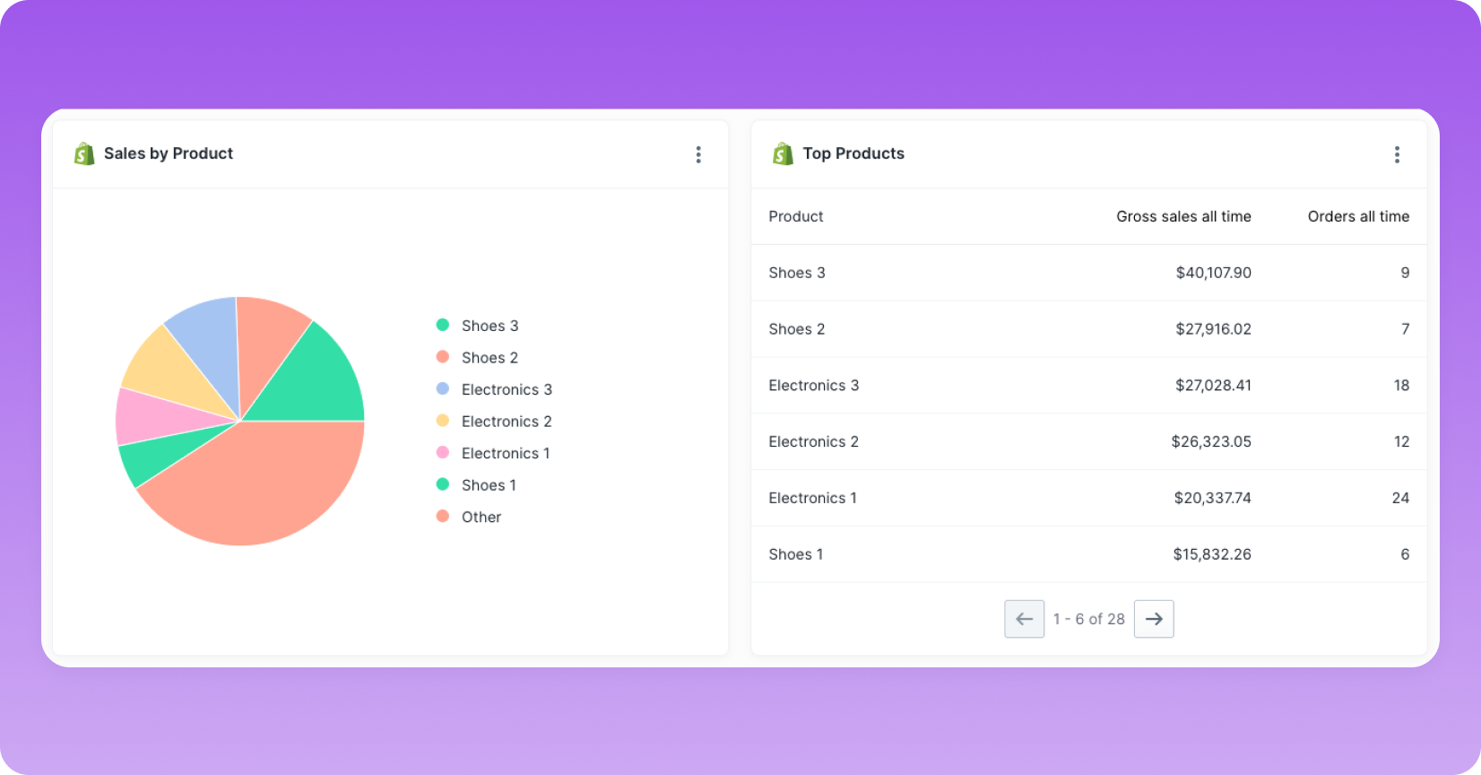
You can now visualize your Shopify metrics segmented by product, referring site, tags, and more.

Pie charts are useful when you want to see one metric, while tables are useful when you want to see multiple metrics for each campaign (ex. sales, orders, refunds).

Other improvements and fixes

  • Fixed issue of not being able to use metrics that don’t have filters
  • Fixed issue with Gorgias YTD data being off
  • Fixed issue with Shopify CLTV data being off

Dashboards

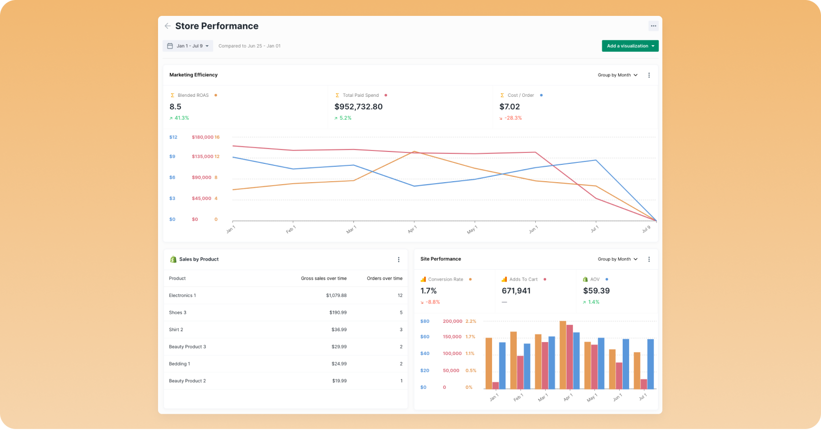
Dashboards will allow you to create custom layouts containing a variety of visualizations for analyzing their data and making informed decisions.

With Dashboards, you'll be able to:

  • Add numbers, time series charts, pie charts, and tables.
  • Customize the layout by making visualizations half width or full width and ordering by dragging and dropping.
  • Select a custom date range or a preset

Read our blog post

Other improvements and fixes

  • Fixed the query to fetch CLTV
  • Fixed an issue with fetching Google filters
  • Fixed inability to add new SnapChatAds measurements
  • Fixed an issue of not being able to edit a future Key Result

ShipMonk Integration

Our new ShipMonk integration lets you track the following shipping and fulfillment metrics:

  • Available items
  • On-hand items
  • Receiving items
  • Fulfillments
  • Items shipped

Other improvements and fixes

  • Improved Gorgias data syncing
  • Fixed an issue with Shopify calculations for discounted orders
  • Fixed an issue for missing data points on a key result progress chart
  • Fixed an issue that prevented users from getting all subject filters from Klaviyo
  • Fixed a delay in Facebook Ads data